Objective - Designing all visual materials associated with the Aggies Leading the Way! Annual leadership conference for attendee outreach, wayfinding, and the conference’s environment.
Purpose of the project - Get the word out about the Center for Leadership Learning’s annual conference to collect as many applicants as possible, as well as design cohesive conference visuals aligning with the theme.
My role - As the Center’s sole graphic design & marketing intern, I was responsible for all the graphics and materials associated with the Aggies Leading the Way! 2019 conference.
Challenge - Expanding my skill set in a realm that I wasn’t at all experienced in—Illustration—as well as learning Adobe Illustrator.
Outcomes - The attendee application cap, raised by 50 from the previous year, was exceeded!
Timeframe - 4 months
Sketching, sketching, and more sketching. The conference theme “The Leader in You: Build, Discover, Share,” was previously chosen by the conference committee. I fixated on the keyword “build” and immediately thought of Legos and Tetris. I used to be obsessed with Tetris, so this was totally up my alley and was incredibly fun to design a conference that was designed with tetrominoes (yes, that’s a real word) in mind.

An example of one of the whiteboard brainstorming sessions I led with the Center’s directors. I don’t make the most beautiful whiteboard sketches, but my drawings do get the point across!
Final Products
Apart from being excited about the Tetris theme, I was also excited to have full creative freedom (apart from branding guidelines of course) over both digital and physical materials. It filled my heart to see all of the attendees navigate and engage in a space that I designed. I hope you enjoy seeing the final products!
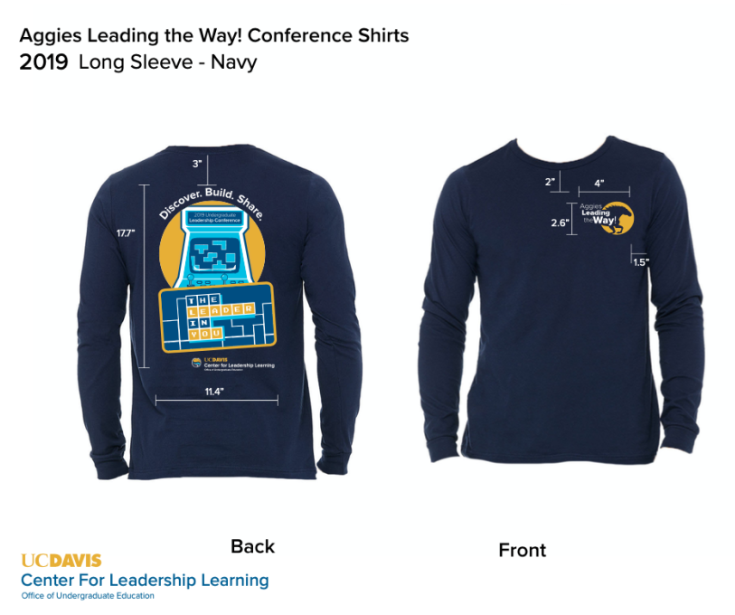
Split between digital (social media campaign, email assets) and physical materials (t-shirt, conference program, table tents, signage, stickers)
After whiteboarding, this was one of the first iterations I designed for the conference theme main graphic.

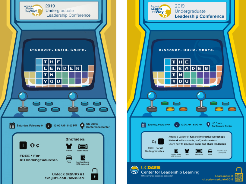
I realized that I was getting too comfortable creating simplistic vector graphics and wanted to give myself a challenge—so I decided to create a fully illustrated poster. On the left is my first draft and on the right is my second: the colors are more vibrant, the artwork is crisp, and the poster is easier to read overall.

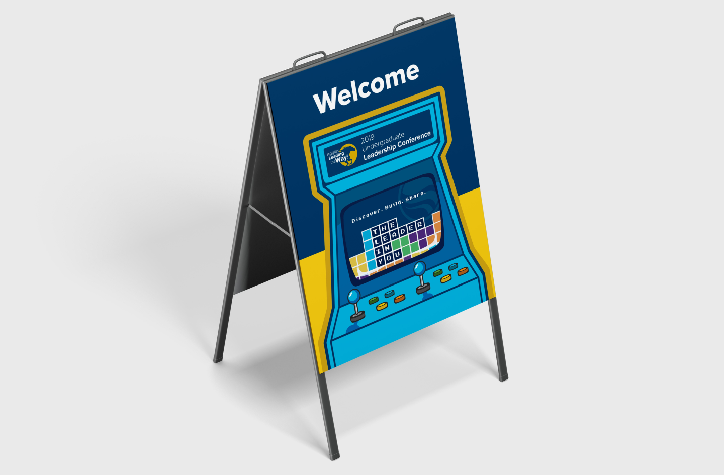
I took my arcade cabinet graphic and created several iterations of it for diferent purposes. We put up A-frames in front of the conference’s building with this design to welcome attendees, to assure them that they’re going into the correct building, and to establish legitimacy of the conference.
A crucial part of the conference experience was having a well-designed program for each attendee to use. The program would stick with each person the entire day and contain information regarding the keynote speaker, workshop topics, and the schedule for the day.

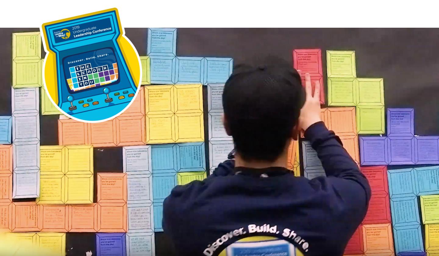
Apart from my graphic design work for the conference, I also designed an interactive tetromino wall and workshop signage. Attendees would answer the prompt on the tetromino and post their reflections on a large Tetris wall. The activity served three main purposes: 1) Engaging attendees by creating an interactive experience; 2) Allowing us to take a timelapse video of tetromino stack growing for marketing purposes; 3) Acting as an informal survey to gain insight into what attendees got out of the day.

Underneath the sticker is a shot taken out of our marketing video for the 2019 Aggies Leading the Way! Conference, featuring a moment in the tetromino wall timelapse.
What I Learned
During this project, I learned the ins-and-outs of Adobe Illustrator and I became a lot more confident about jumping out of my design comfort role. I worked as a solo designer for this project, which comes with learning time management skills with self-made deadlines, as well as learning efficient file organization for a project at this scale with dozens of different final drafts. I also learned how to creatively work within strict branding constraints.
prev/next