
Objective - Create a youthful, authentic, yet professional website.
Purpose of the project - Publish a website that appeals to potential donors.
My team - I worked on a team of three: 2 designers, 1 technical writer.
My role - Research, UI design, graphic design
Timeframe - Five hours
Why I Chose This Project
I chose this project because it benefitted a community that I am a part of—I was able to use my skills for something impactful on the other side of the world through the power of technology. I also learned a lot of new skills within a short timeframe and was able to meet dozens of new people!
Out in Tech Digital Corps
You may be asking: what exactly is Out in Tech Digital Corps? Out in Tech hosts all-day web building sessions with Digital Corps volunteers. It’s similar to a hackathon, but the work directly impacts the online presence of LGBTQ+ organizations that may not have been able to afford a design team otherwise.

The Client
The client was a founder of a non-profit organization in Botswana called Success Capital Organisation. The organization supports LGBTQIA+ folks that have been otherwise ill treated by society.
Client goals:
Appeal to donors
Appear youthful, authentic, and indigenous
Team goals:
Design a logo
Design a website
What We Were Given
We were given a website spec going over the client’s preferences, a 30-60 minute online call opportunity to interview them, as well as folders of photos, text for the site, and other resources.

Day-of Issues
In a perfect Digital Corps world, volunteers are grouped into teams of 6, where the teams were well-rounded and consisted of developers, designers, and technical writers. However, when it came to the day-of, my team consisted of only 3 members: no developers, 2 designers, and 1 technical writer. None of us had ever used WordPress before and we only had 5 hours until the deadline—so it was immediately crunch time.


Breaking It Down
To complete the site within the timeframe, we had to learn on-the-job and be quick on our feet. We started by creating a list of tasks required for a basic website, assigned leads for each task, asked other groups for help when issues arose, had a working lunch, and drank lots of coffee.
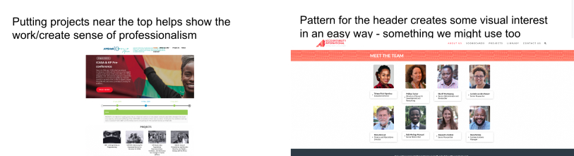
Competitor Analysis
Our team was lucky enough to have a 30-50 minute conversation with the founder of the organization, giving us the time to interview the client and establish clear website goals. During this interview, they mentioned how they admired the websites of other organizations in Africa that fight for the same thing they do. We then went to work and created a collection of desired website features on Google Slides.

Sketching and Brainstorming
After interviewing the client, I worked with an experienced UX/UI designer on the team who quickly became a mentor figure to me during this project. He led the team in the “whiteboard design challenge,” where we created personas to establish a clear idea of who our audience is. I also sketched out user flows for the site to determine what pages we needed and where.
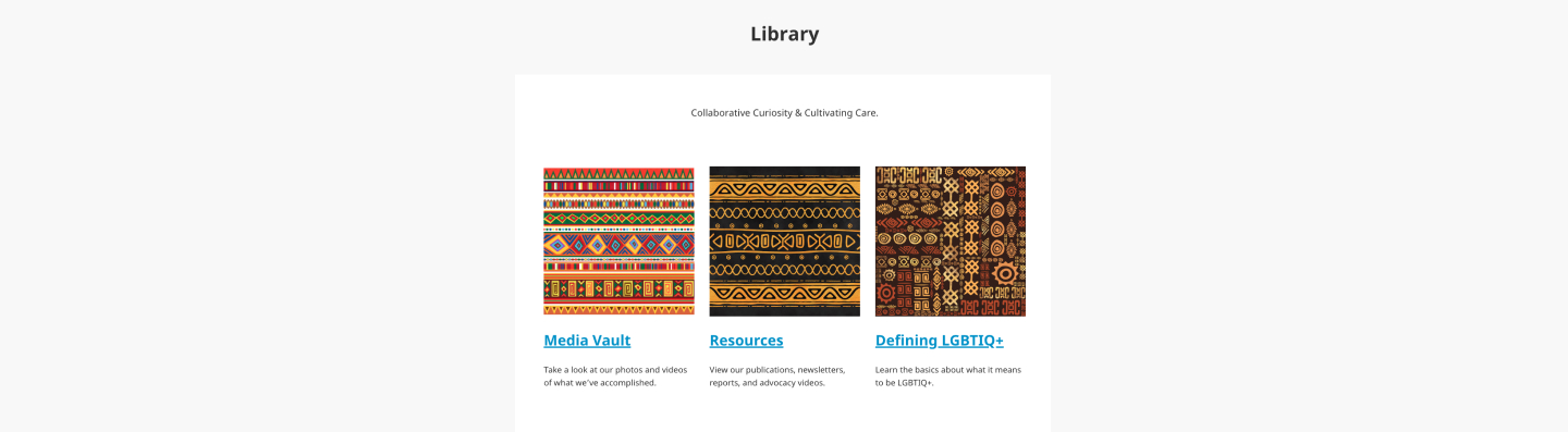
After determining the necessary pages, I designed the “Library” pages, which included African patterns that the client wanted to feature on the website.
Logo
Within the five hours that the team had, I spent thirty minutes of it conceptualizing a new logo for the organization. The goal for the logo was to create something that encapsulated these qualities: authentic, African, colorful, minimalist, sleek, and LGBTQ+. The logo consists of a rainbow African woven basket held up by the organization's three pillars, where the middle pillar is the flag of Botswana.

The organization’s “three pillars” of what makes a thriving community.

The organization’s old logo vs. the redesign.

What I Learned
Needless to say, this project was under a heavy time constraint and was exhausting. I spent the entire day absorbing knowledge like a sponge and doing whatever I could to work with my team and publish the site. It was incredible to be able to learn from people who have been in their careers for several years and get the chance to work with them.
Key takeaways:
1) You can’t always fulfill a client’s wishlist and you have to be realistic about your constrations
2) Sometimes it’s more important to prioritize working on the website’s usability than its aesthetics
What I Would Have Done Differently
I sincerely wish I had more time to work on this project. Days after completion, I was still coming up with features that would have been a great addition to the website. One of these features would be an interactable map with pinned points—each point representing an LGBTQ+ organization that was in Success Capital’s network. Something like this would have added credibility for the organization, possibly persuading a donor.
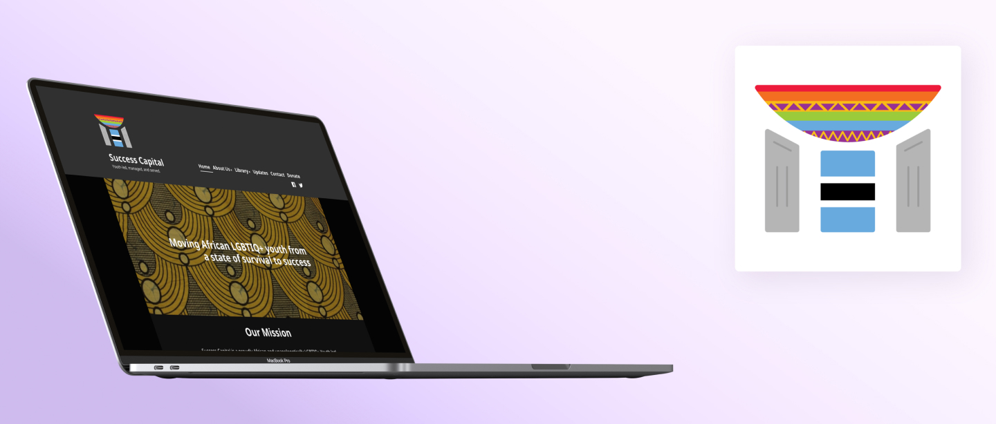
The final product! Pictured: Final landing page & a copy of the redesigned logo.
prev/next